Plotting#
marimo supports most major plotting libraries, including Matplotlib, Seaborn, Plotly, and Altair. Just import your plotting library of choice and use it as you normally would.
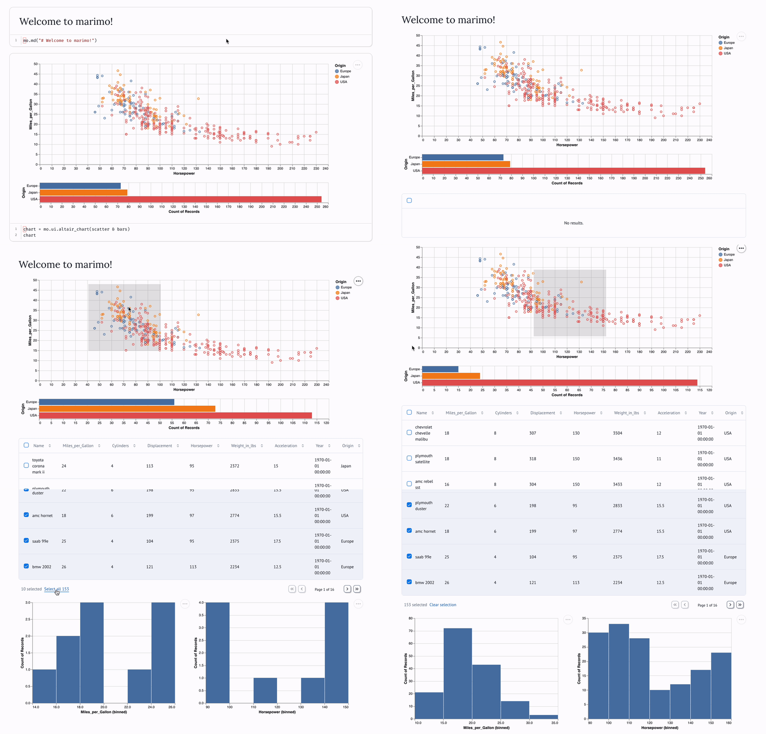
For Altair plots, marimo does something special: use mo.ui.altair_chart
to connect frontend selections to Python!
Reactive plots!
marimo supports reactive plots via
mo.ui.altair_chart! Select and
filter with your mouse, and marimo automatically makes the selected data
available in Python as a Pandas dataframe!
Reactive plots! ⚡#
Use mo.ui.altair_chart to easily
create interactive, selectable plots: selections you make on the frontend are
automatically made available as Pandas dataframes in Python.

Requirements
Reactive plots currently require Altair. Install it with pip install altair
In the future, we may make other plotting libraries reactive.
Wrap an Altair chart in mo.ui.altair_chart
to make it reactive: select data on the frontend, access it via the chart’s
value attribute (chart.value).
Reactive plots are just one way that marimo makes your data tangible.
Example#
import marimo as mo
import altair as alt
import vega_datasets

# Load some data
cars = vega_datasets.data.cars()

# Create an Altair chart
chart = alt.Chart(cars).mark_point().encode(
    x='Horsepower', # Encoding along the x-axis
    y='Miles_per_Gallon', # Encoding along the y-axis
    color='Origin', # Category encoding by color
)

# Make it reactive ⚡
chart = mo.ui.altair_chart(chart)
# In a new cell, display the chart and its data filtered by the selection
mo.vstack([chart, chart.value.head()])
Learning Altair#
If you’re new to Altair, we highly recommend exploring the Altair documentation. Altair provides a declarative, concise, and simple way to create highly interactive and sophisticated plots.
Altair is based on Vega-Lite, an exceptional tool for creating interactive charts that serves as the backbone for marimo’s reactive charting capabilities.
Concepts#
Learn by doing? Skip this section!
This section summarizes the main concepts used by Altair (and Vega-Lite). Feel free to skip this section and return later.
Our choice to use the Vega-Lite specification was driven by its robust data model, which is well-suited for data analysis. Some key concepts are summarized below. (For a more detailed explanation, with examples, we recommend the Basic Statistical Visualization tutorial from Altair.)
Data Source: This is the information that will be visualized in the chart. It can be provided in various formats such as a dataframe, a list of dictionaries, or a URL pointing to the data source.
Mark Type: This refers to the visual representation used for each data point on the chart. The options include ‘bar’, ‘dot’, ‘circle’, ‘area’, and ‘line’. Each mark type offers a different way to visualize and interpret the data.
Encoding: This is the process of mapping various aspects or dimensions of the data to visual characteristics of the marks. Encodings can be of different types:
Positional Encodings: These are encodings like ‘x’ and ‘y’ that determine the position of the marks in the chart.
Categorical Encodings: These are encodings like ‘color’ and ‘shape’ that categorize data points. They are typically represented in a legend for easy reference.
Transformations: These are operations that can be applied to the data before it is visualized, for example, filtering and aggregation. These transformations allow for more complex and nuanced visualizations.
Automatically interactive.
marimo adds interactivity automatically, based on the mark used and the
encodings. For example, if you use a mark_point and an x encoding, marimo
will automatically add a brush selection to the chart. If you add a color
encoding, marimo will add a legend and a click selection.
Automatic Selections#
By default mo.ui.altair_chart
will make the chart and legend selectable. Depending on the mark type, the
chart will either have a point or interval (“brush”) selection. When using
non-positional encodings (color, size, etc),
mo.ui.altair_chart will also
make the legend selectable.
Selection configurable through *_selection params in
mo.ui.altair_chart. See the API
docs for details.
Note
You may still add your own selection parameters via Altair or Vega-Lite. marimo will not override your selections.
matplotlib#
To output a matplotlib plot in a cell’s output area, include its Axes or
Figure object as the last expression in your notebook. For example:
plt.plot([1, 2])
# plt.gca() gets the current `Axes`
plt.gca()
or
fig, ax = plt.subplots()

ax.plot([1, 2])
ax
If you want to output the plot in the console area, use plt.show() or
fig.show().
Interactive plots#
To make matplotlib plots interactive, use mo.mpl.interactive. (Matplotlib plots are not yet reactive.)